
MenuClose
Graphic / Type & Print
Back to homeInk, line,& letterform.
Three assignments from type and editorial coursework: a film-season poster drawn like a riso print, a conference identity written in one unbroken line, and a Borges reader designed, set, and bound as a magazine — readable here page by page.
01 / Conference identity
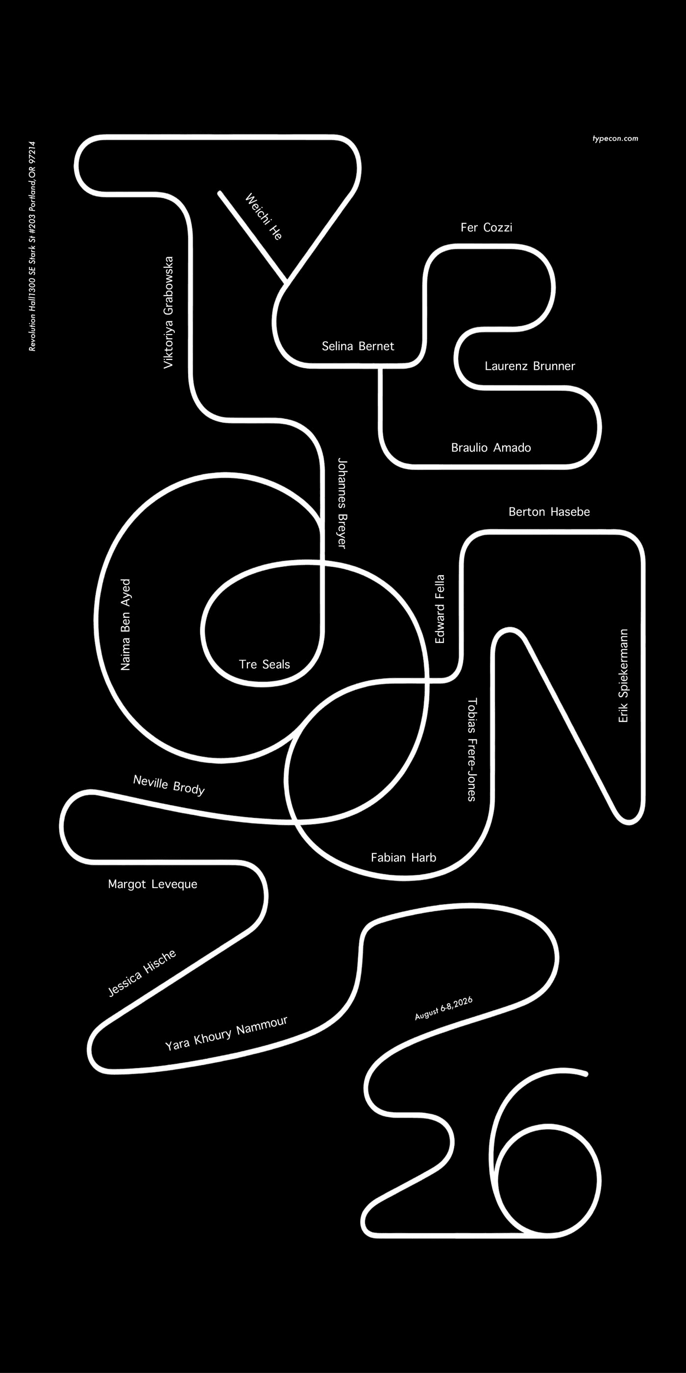
TypeCon 2026
One continuous line writes “TYPECON26”; fifteen speaker names ride it like stations on a route. Revolution Hall, Portland OR · August 6–8, 2026. Two colourways of the same path.
- VenueRevolution Hall, Portland OR
- DatesAugust 6–8, 2026
- SpeakersFifteen, set along one line
- TypefaceFutura Medium Italic

02 / Screening-season poster
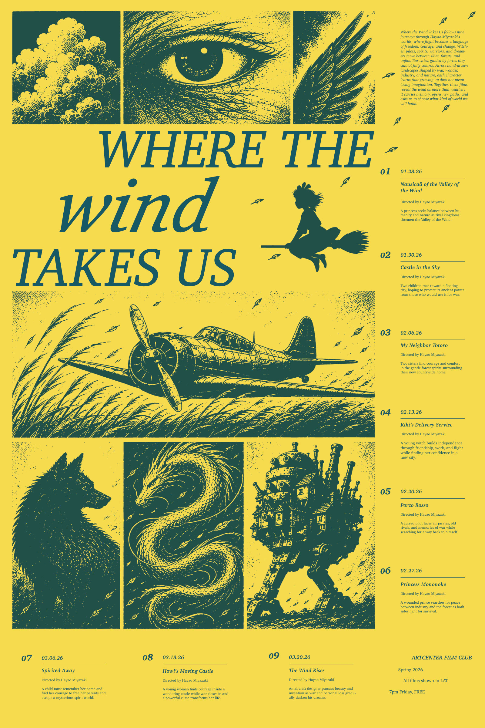
Where the Wind Takes Us
A nine-film Miyazaki season for the ArtCenter Film Club, Spring 2026. Two inks — sulfur yellow and deep teal — and a hand-drawn vignette for every film on the programme.
- ClientArtCenter Film Club
- SeasonSpring 2026 · nine films
- InksSulfur yellow + deep teal
- Size22 × 33 in
Colour palette
- Sulfur yellow#F8DB51
- Teal ink#315A4B
- Overprint olive#BEB650
Two inks, riso-style: a sulfur ground and a single teal drawing ink. The olive is never printed — it only exists where the two halftones overlap.
Typeface — Charter
- Charter Black ItalicDisplay title
- Charter ItalicFilm titles & folios
- Charter RomanSchedule & notes
One serif family carries the whole sheet — hierarchy comes from weight and italics, not from extra typefaces.
03 / Editorial design
Borges · Labyrinths
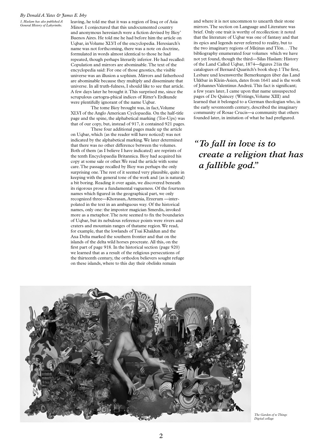
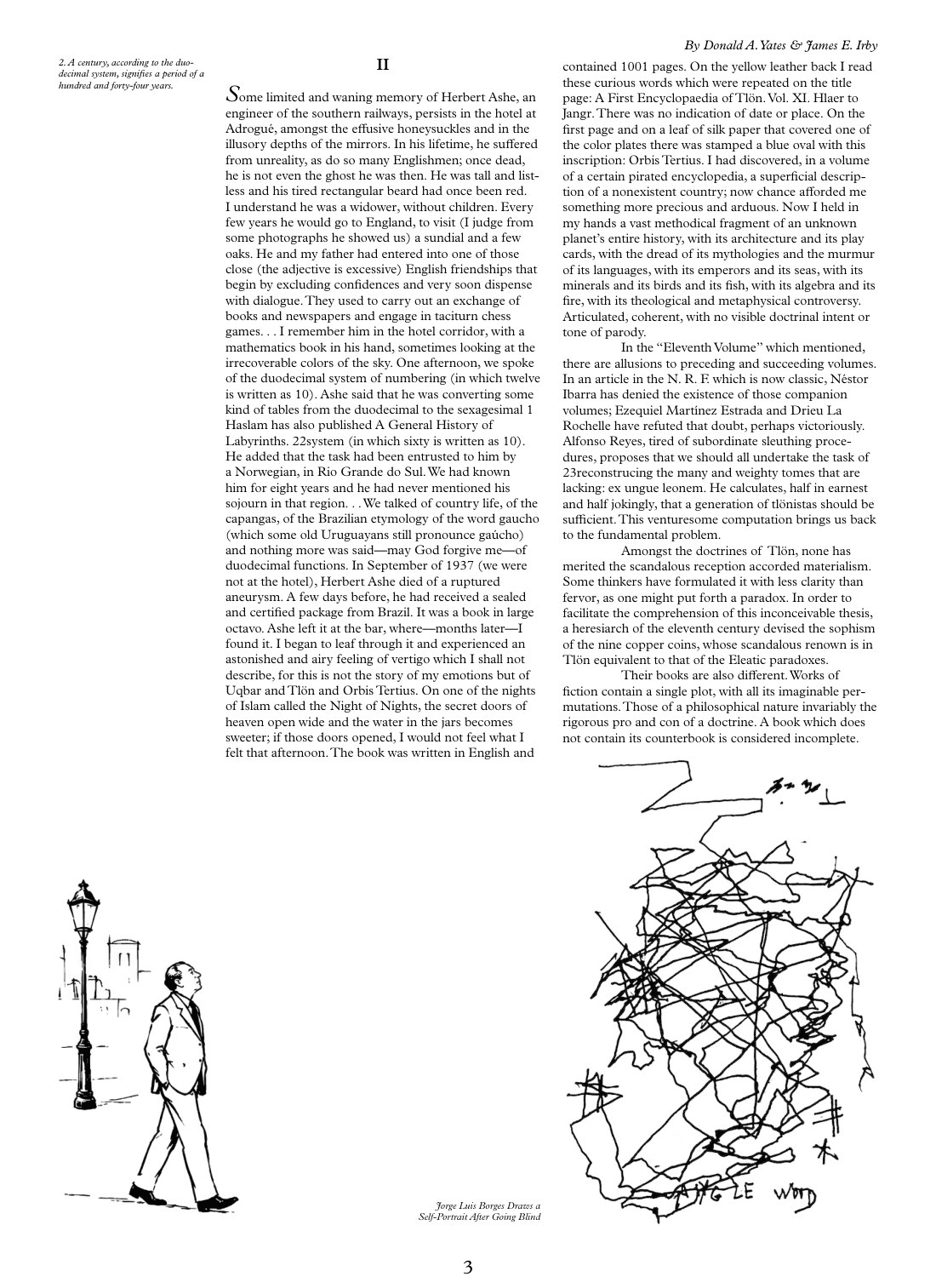
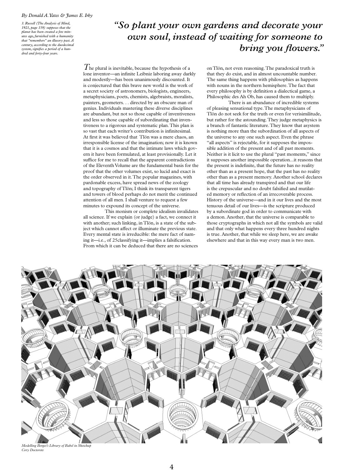
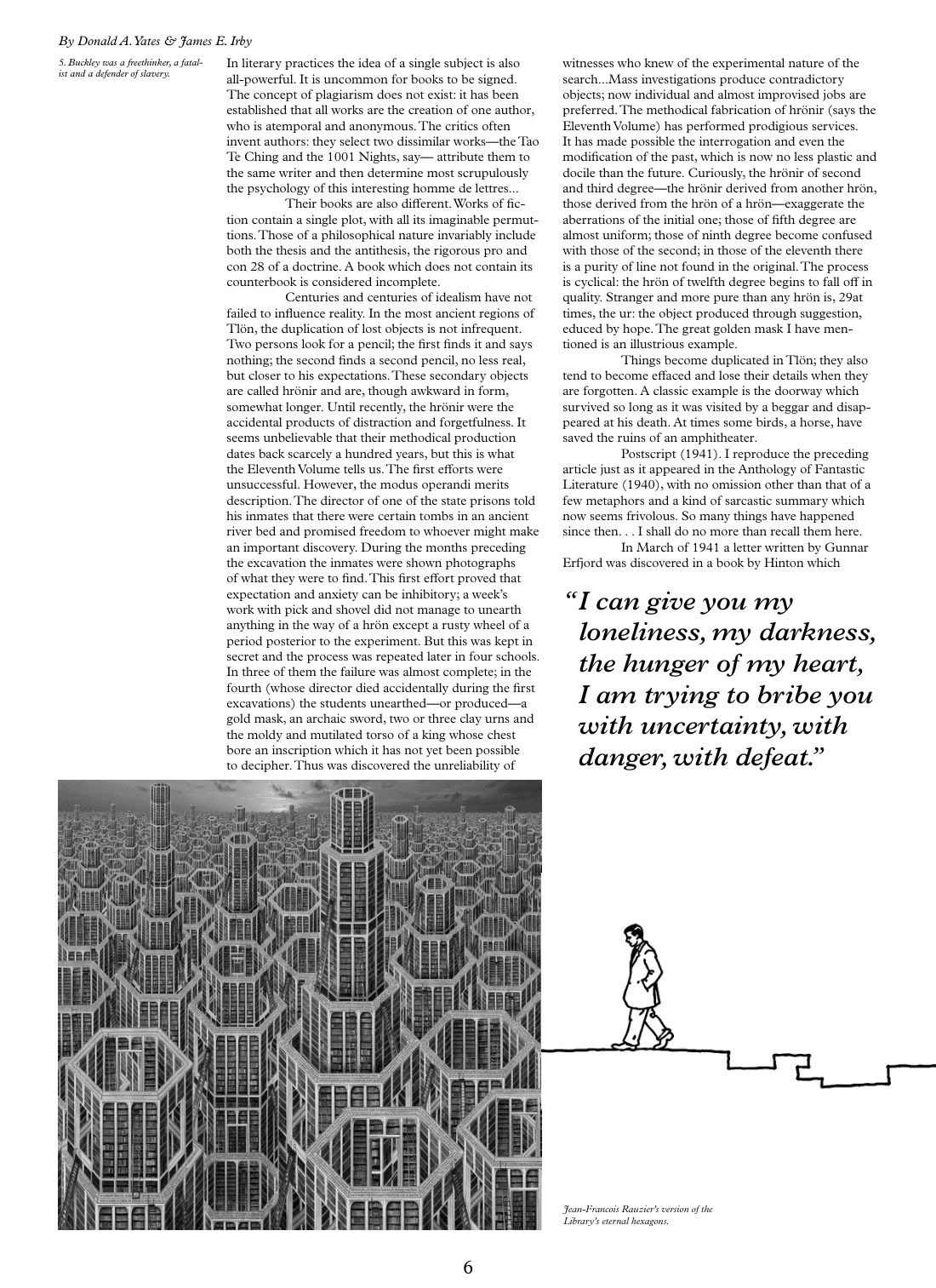
A twelve-page reader on Jorge Luis Borges — Tlön, the Library of Babel, and the garden of forking paths — set in black ink only. Turn the pages: click the right page to read on, the left to go back.
- AuthorJorge Luis Borges
- Format8.5 × 11 in · 12 pages
- TypefacePlantin MT Pro
- BindingSaddle-stitched
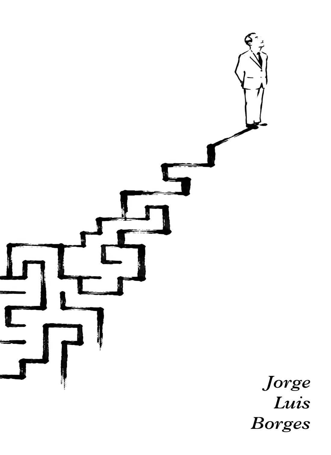

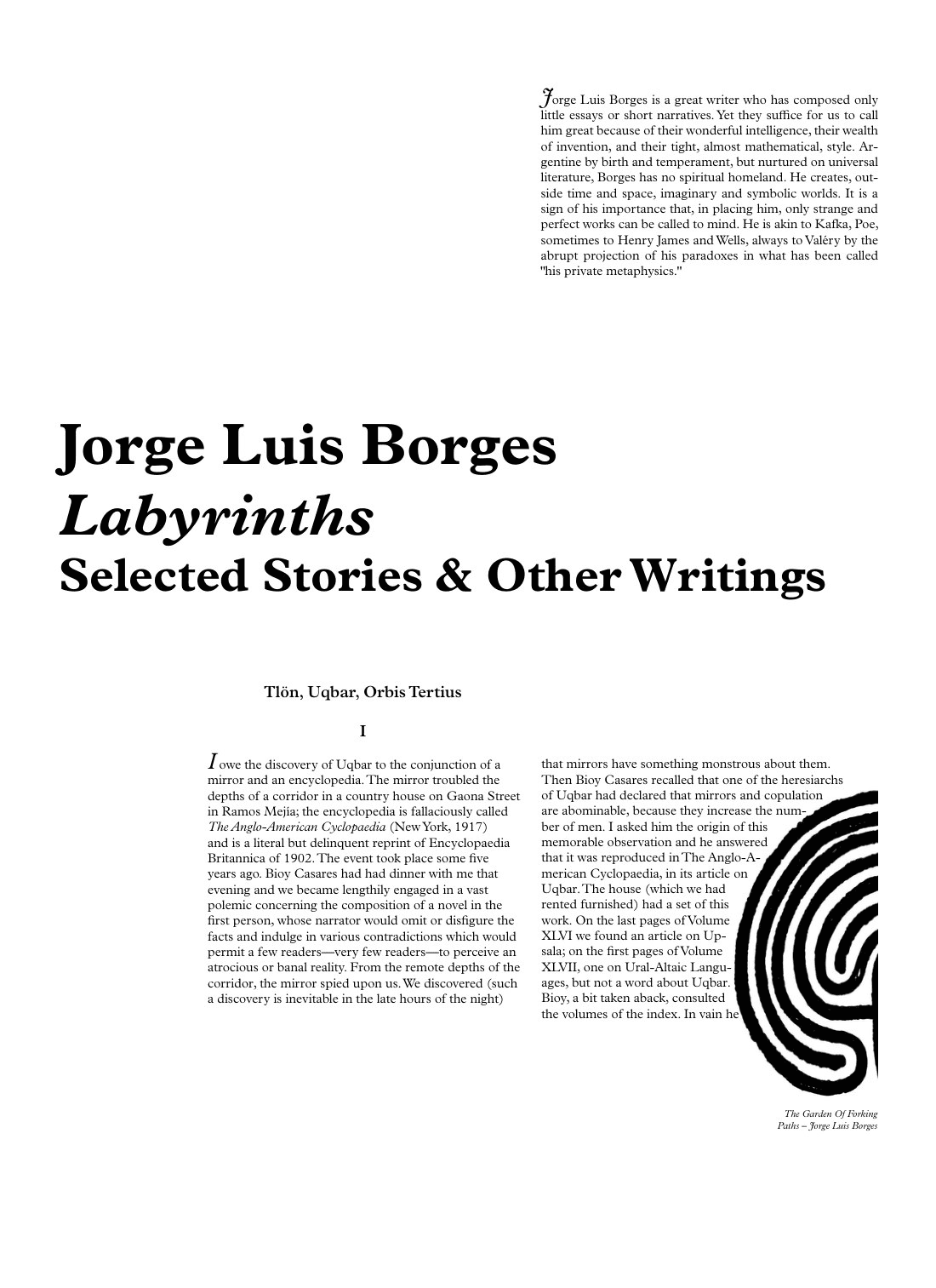



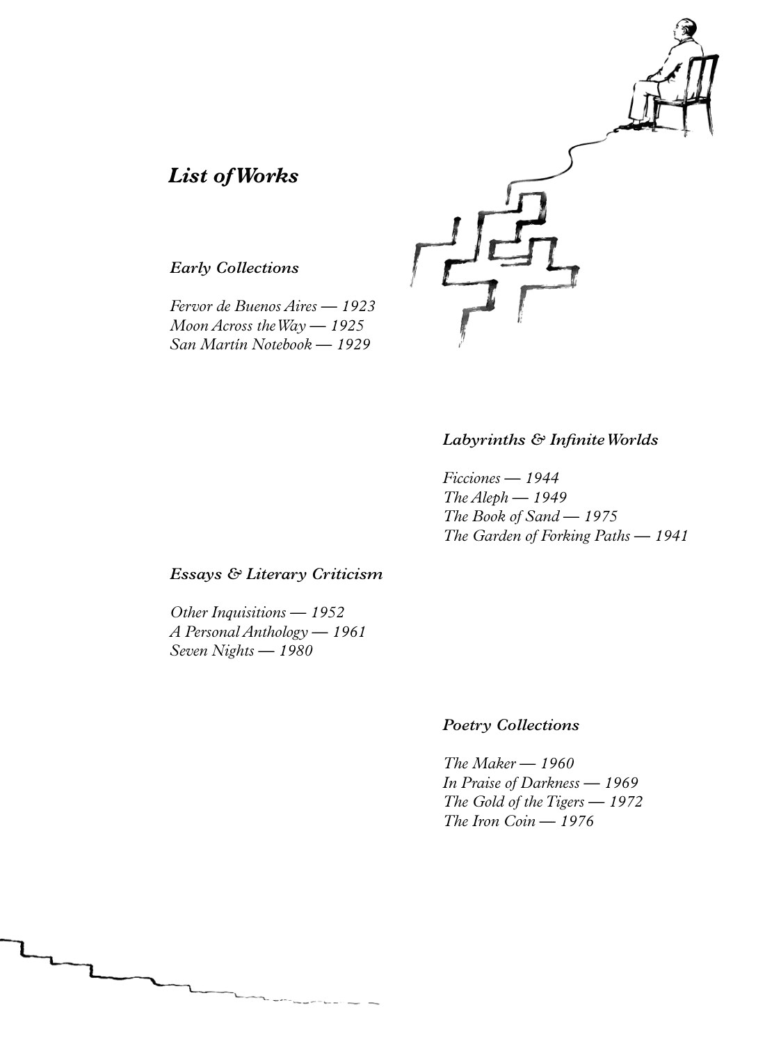
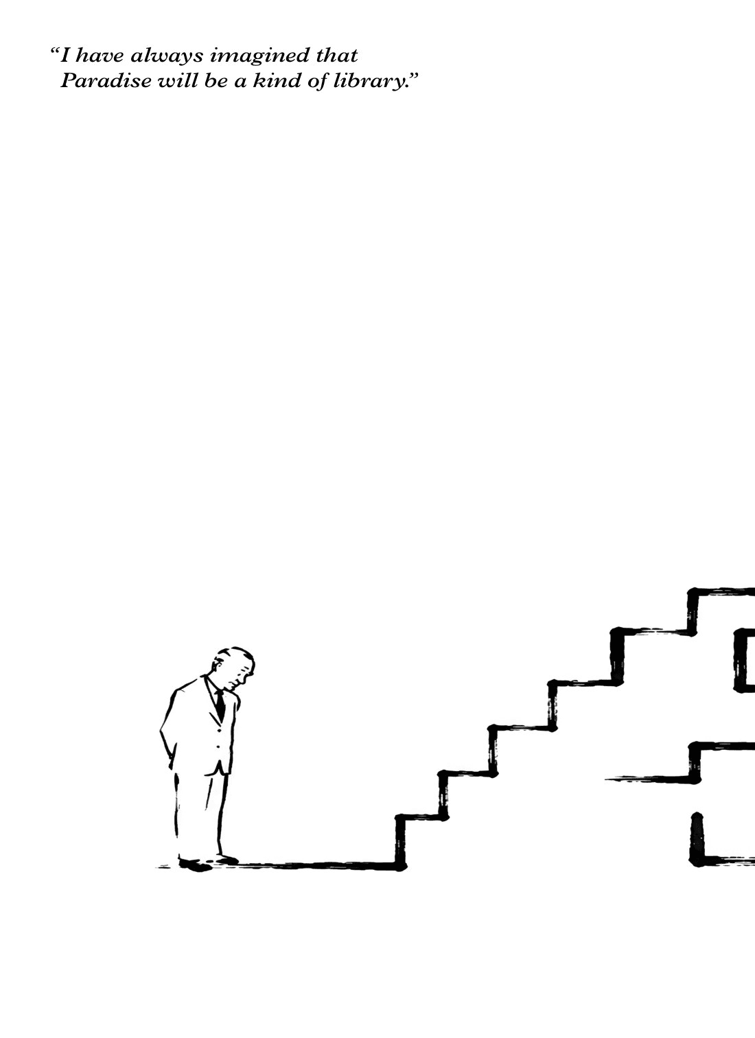
Cover · spread 1 of 7