
MenuClose
Wander LA
A playful map for learning how Los Angeles architecture thinks.
An author-drawn interactive map that helps children and design audiences discover Los Angeles history through eight architectural landmarks, story cards, and Day / Night exploration.
Explore Los Angeles through place, light, and story.
The design challenge was to make unfamiliar architecture inviting without losing spatial orientation or turning discovery into a lecture.
Architecture becomes approachable when the first question is visual.
The source work includes architecture content research, concept mapping, UI exploration, presentations to children, and a UK design audience.
I show the evidence that is documented in the project and do not invent participant counts, test metrics, or educational outcomes.
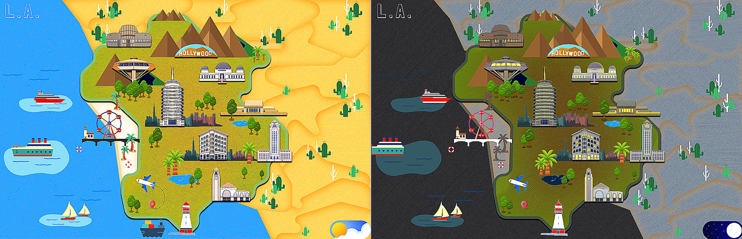
Eight landmarks create a manageable first collection.
Each building pairs history, style, and one memorable visual idea.
Time is easier to feel when the scene changes.
The day/night state turns historical comparison into a visible interaction.
The story must work beyond an architecture classroom.
Presenting the project to children and designers in the UK pushed the language toward short, visual explanations.
Eight landmark stories
The first collection must stay manageable and memorable.
One repeatable story card with one learning idea per stop.
Day and night environmental exploration
Time should be felt through the scene—not only explained in copy.
Lighting, sky, and story emphasis change while landmark position stays fixed.
Shared with children and a UK design audience
The language needs to travel across age and cultural context.
Short visual prompts with a second layer of optional companion context.
Make architecture approachable through looking and play.
- Short visual invitations
- Buildings that feel memorable
- A map that rewards curiosity
Translate landmark history into illustrated moments children can open and discuss.
Understand the interaction model as clearly as the visual idea.
- A legible Day / Night state
- Clickable architectural entry points
- A repeatable historical story format
Show how one authored map becomes a coherent interactive system—not a collection of isolated screens.
How might an interactive map help children notice how Los Angeles architecture carries history and culture—without turning discovery into a lecture?
Every landmark teaches one idea through the same four-beat rhythm.
A repeatable card model turns the research opportunity into a system that is easier to scan, author, and remember.
Creates a stable identity across map, story, and collection.
Site + pattern turns history into one idea to notice.
The stepped roofline and hollyhock geometry give children an immediate way into the story.

The Hollyhock House
How can a building borrow a flower's geometry and still belong to its hillside?
Invites noticing without requiring prior architecture knowledge.
History and cultural detail stay available without blocking the first scan.
Collect the idea, return to the route, and keep the learning loop visible.
The Hollyhock House
How can a building borrow a flower's geometry and still belong to its hillside?
OPEN FIELD NOTE →
Griffith Observatory
How does the building frame a relationship between the city and the stars?
OPEN FIELD NOTE →
Los Angeles Union Station
How can one civic place make many different journeys feel connected?
OPEN FIELD NOTE →
Los Angeles City Hall
Which proportions make a public building readable from across the city?
OPEN FIELD NOTE →
Capitol Records Building
Why can a repeated circular form become a symbol for an entire city?
OPEN FIELD NOTE →
Idle Hour Café
Why might a café be shaped like the thing it serves?
OPEN FIELD NOTE →
Bradbury Building
How does daylight turn an interior atrium into a vertical street?
OPEN FIELD NOTE →
Chemosphere House
How does an octagonal house balance above a steep hillside?
OPEN FIELD NOTE →Let the authored Los Angeles map introduce the collection.
Give every landmark a distinct visual identity and story.
Use mini timelines and image comparisons instead of long history copy.
Day and Night change atmosphere while preserving orientation.
The route stays stable while the city shifts from day to night.
The interaction evolved from a static landmark collection into two authored environmental states—not a false past, present, and future timeline.
The interaction changes environment—not the underlying architecture.
The paired source frames preserve each building's authored silhouette while updating sky, windows, contrast, and atmosphere. This makes the change legible without introducing a false timeline.
- Same landmark identity preserves orientation
- Night lighting reveals a second reading of form
- Day and Night remain explicit text labels

The Hollyhock House
The same authored building asset is preserved across both states; only environment, lighting, and illuminated detail change.

Day collection
Eight original daytime illustrations foreground silhouette, material, and civic context.
Night collection
Eight matching night illustrations reveal lighting, atmosphere, and the same stable landmark identity.
One city flow; one landmark story flow.
Switch between exploring the complete map and reading the history inside a selected building.
Move from the complete Los Angeles map into one architectural story.
The path from map to landmark story stays obvious in both environmental states.
Different navigation paths lead to the same learning moment.
- 01Marker + current stop→
- 02Route + travel context→
- 03Landmark story
- 01Ordered stop list→
- 02Distance + mode text→
- 03Same landmark story
The interface feels playful, but the hierarchy stays disciplined.
Bold map colour, paper labels, and collectible moments sit on top of a predictable interaction system.
One map, two atmospheres.
Colour changes time and mood; the map structure, landmark silhouettes, and interaction targets stay fixed.
VISUAL EVIDENCE FROM THE AUTHORED DAY / NIGHT FRAMES · NOT PRESENTED AS A FORMAL HEX TOKEN LIBRARY
Use colour to orient, never as the only signal.
Editorial character with simple instructional language.
Look closely.
What makes it move?
Reward observation, not speed or correct guessing.
RESPONSIVE PRINCIPLEThe route stays visible; secondary context collapses into field notes.
Motion preserves orientation while each layer of the city opens.
The scroll story connects one product decision to the next: orient in Los Angeles, shift time, choose a landmark, then reveal its history.
- 01 · COMPLETE AUTHOR-DRAWN MAP
Enter the city.
I kept all eight landmarks in one spatial model so orientation comes before content—not as a menu of disconnected screens.
- 02 · DAY / NIGHT TOGGLE
Change the atmosphere.
Rather than duplicate the map, one sun-and-moon control changes light, sky, windows, and mood while preserving spatial memory.
- 03 · CLICKABLE LANDMARKS
Choose a building.
Each illustrated building works as both character and affordance: a recognizable, low-friction entry into one architectural story.
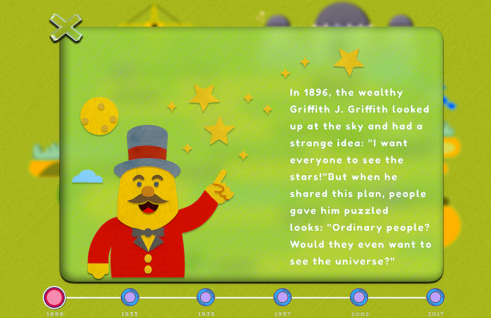
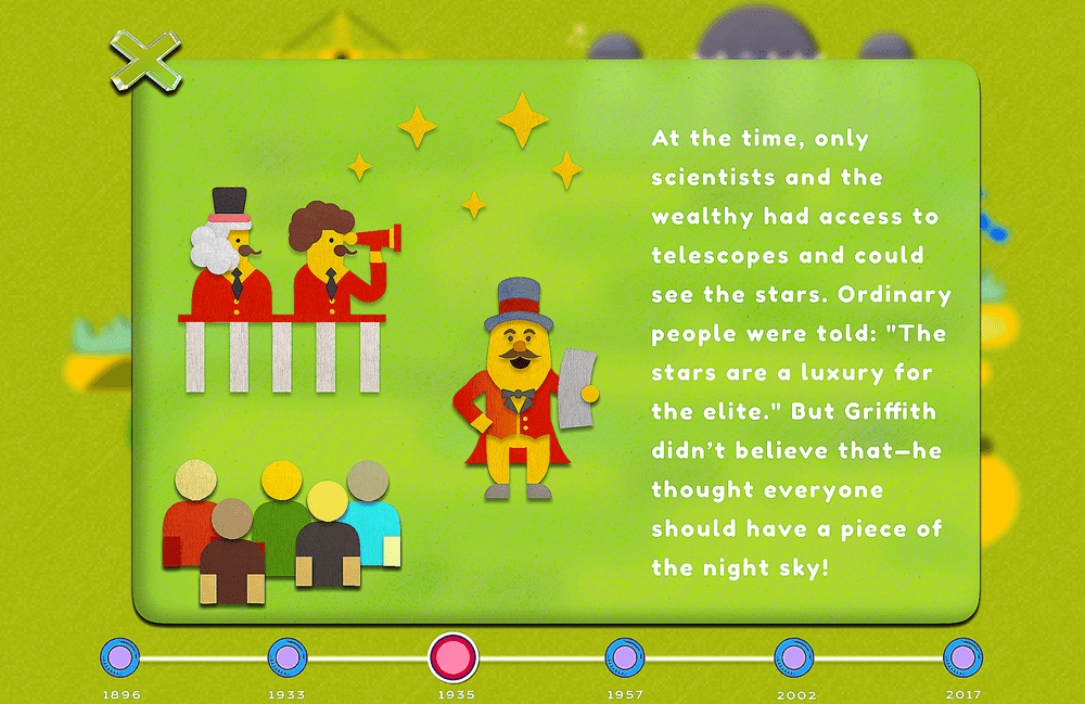
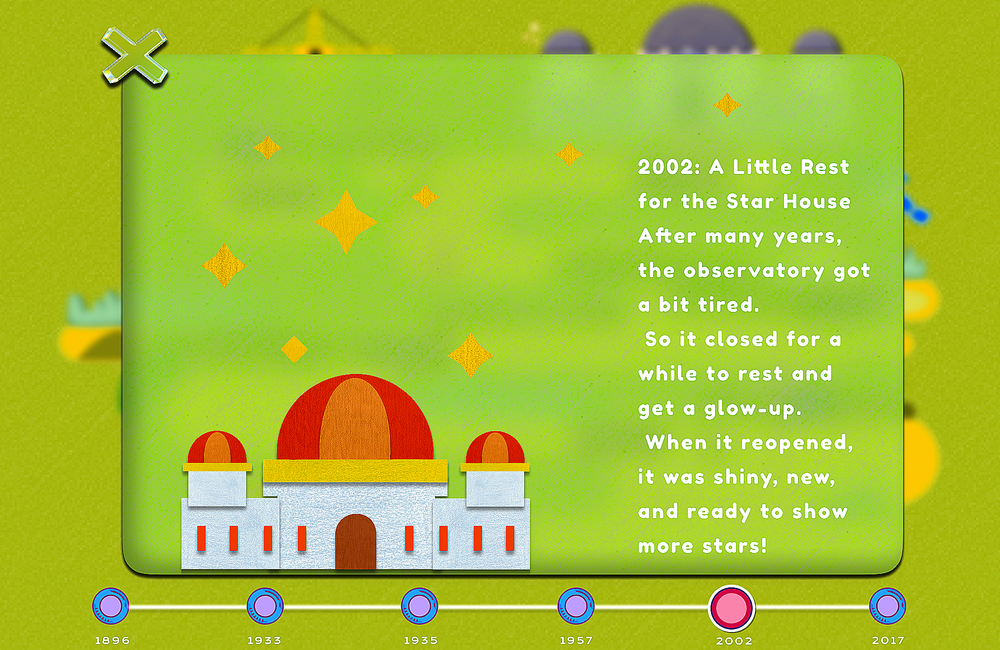
- 04 · HISTORICAL TIMELINE
- 1896
- 1935
- TODAY
History → cultural moments → image comparison
Move through its story.
A repeatable timeline combines history, cultural moments, and vintage-to-modern comparisons without turning discovery into a report.
IMPLEMENTATION READINESSOpen the interaction handoff+
These are design-level specifications for a future engineering handoff; the case does not claim completed engineering collaboration or production implementation.
Real-world presentation shaped the story; structured testing is the next step.
I separate documented presentation experience from the task-based validation plan I would run next.
Shared with children, then presented to designers in the UK.
This tested whether the concept, map language, and architectural stories could travel across age and cultural context. I treat those presentations as communication evidence—not as quantified usability results.
Every route needs a non-map equivalent.
Provide an ordered stop list, distance and transport text, clear focus order, and landmark descriptions.
Prompts should invite noticing, not test prior knowledge.
Avoid timed scoring, colour-only instructions, and a single “correct” observation.
Animation supports orientation and respects preference.
Route drawing and marker motion are removed when reduced motion is requested.
My strongest move was turning a directory into a learning journey.
The map, content model, and interface all reinforce the same behaviour: look closely, connect the detail, and keep the discovery.
One content grammar across eight landmarks and two levels of guidance.
A route that makes progress visible without turning learning into points.
An LA-specific palette and map language inside the wider archive system.
DESIGN INTENT“Help people leave the map looking at the city differently.”